'Due' app redesign

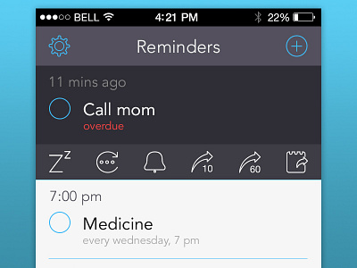
'Due' (http://dueapp.com) is one of my favourite apps on iOS. It has been on my home screen for more than 2 years now. It's a great app, but I don't quite like the visual design of the app. This shot is a humble take on how it should look. I have created a new set of icons and changed the colour scheme to make things more crisp and neat.
All the icons were created in illustrator, and the design was done in Photoshop. Don't forget to check out the @2x version and real pixels!


