


New Product Screenprints - 2021


I've been working with our product designer on updating our packing across our entire line of products and can finally show off the final results! The overall goal was to step up our product's curb appeal in stores.
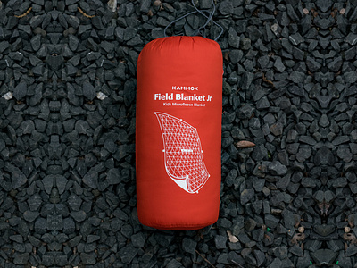
The new screenprints prioritize our brand, legibility, and clarity. The first step was to put the information front and center, literally. The logo has been refined to look stronger at a smaller size. The product name and type are centered and more visible from a distance. Most importantly, I've added an illustration of what the product looks like out of its stuff sack. Even if you only take a glance at the product on the shelf, you should quickly be able to understand what the product is and looks like unfurled.
If you look at the second image in this set, our original screenprints were very unopposing. Kammok went with this approach to let our bright product colors stand out on the shelves at REI and our other retailers. This inadvertently led to our brand logo and the product type (blanket, hammock, sleeping pad, etc.) being very small on the shelf and we ended up being easily looked over for our competitors.
Overall, I'm really pleased with how these turned out! Shout out to our product designer and team to help get these across the finish line and out into the world. This is a project almost two years in the works and we got it across the finish line! I'll be posting our new hangtags and perhaps some on-product screenprint updates next.
Images belong to Kammok.


