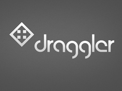
Logo for Webapp
I am planning a web application for project management which uses a lot of drag&drop stuff. I chose the name "draggler" a while ago, but it is quite hard to create a logo for it, the 2 "g"s are not easy to align (the g is an ugly character imho). So I built this completely from scratch without fonts, just using (parts of) cycles. The picture mark is for symbolizing collaboration (the 4 squares) and also the mouse icon for moving (negative space).
More by MadeMyDay View profile
Like


