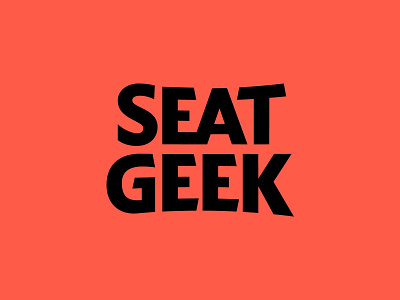
SeatGeek Logo Redesign
This is one of those projects for the books, for us. SeatGeek approached Hoodzpah to create the new logo for a rebrand they were collaborating on with brand hit-maker Mother Design, and illustrator Mickey Duzyj. SeatGeek is the leading mobile-first ticketing platform where fans can buy and sell tickets. The goal of the rebrand? To breathe the life of live events back into the brand, differentiating from tech-sleek competitors.
Working with SeatGeek’s in-house design team (led by Creative Director Tim McCarthy), Mother Design expertly set the tone for the project. Their strategy and design drew from the dynamic event ephemera of yesteryear. The custom type is inspired by the lively typography that used to dominate show-posters, and still lives on in venue marquees, and even on Jumbotrons. The curved wordmark also alludes to the horizon lines of stadiums, stages, and theater terraces that are the backbone of live events. But it still maintains a modern execution necessary for the online and mobile product.
See Armin Vit's review of the rebrand on Brand New today and vote your feelings!


