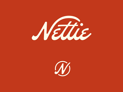
Nettie — Pickleball Brand Identity
Nettie founder, Catherine Baxter, came to Hoodzpah looking for a nostalgic and playful design sensibility that hearkened back to old racquet clubs of yesteryear. The goal was to make a visual presence that would appeal to more design-savvy consumers, without alienating casual players or serious athletes. We wanted to make the best looking, best playing, best value Pickleball brand out there. The custom-made wordmark’s script figures add a sense of motion, with the arcing swash of the N sending a Pickleball to the tittle of the “i”. Scope — Logo System — Typography, Color — Paddle Designs — Packaging — Brand Guidelines See full case study here: https://hoodzpahdesign.com/portfolio/nettie-pickleball-brand-identity/ Shop Nettie: www.playnettie.com Fonts in use: New Kansas by Newlyn Foundry and Montserrat from Google Fonts.


