Tesco Handmade
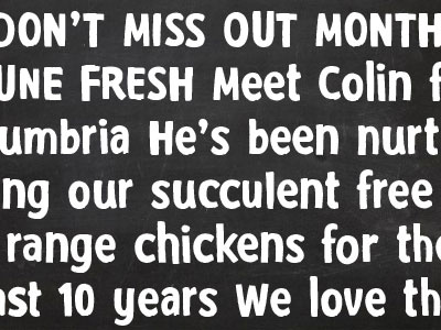
It was almost a year ago when The Clearing approached me to design a new display font for Tesco. Let's face it Tesco have being going through some tough times and our task was to help their image by creating a set of characters that could carry a more 'human and honest voice'. So far two weights holding many contextual alternates have been produced and are gradually being rolled out across all stores. More here: http://instagram.com/p/qQ7dSQgLjw/?modal=true


