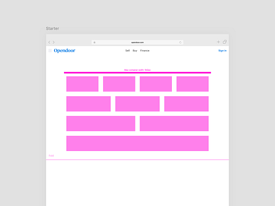
960px grid layout

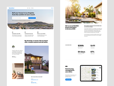
This is a layout exploration for our localized seller landing page template on Ipad landscape using 1/2 and 1/3 columns. I personally prefer to cap at 3 columns but will sometimes push to 4 if needed (at 960px with gutter 1/4 get really narrow).
In the era of flexbox, fluid responsive and a lot of adaptive web experiences I still believe that very few things need more than the classic 960px grid. I sometimes expand the grid container to 1280px or full width for hero sections. 960 is not exciting but provides the flexibility needed for most types of content while being a framework that provides clear guidelines for both engineering and design to collaborate effectively.
The reality of the many screen sizes out there plays against web designers. My way to approach this may sound simplistic but it make my job possible. I design websites like if I was still in 2011 (bootstrap release) with 2.5 break points + exception for center pieces. I'm sure agency designers have good reasons to go beyond this but as an in-house designing and building for scale it makes a real difference. By that I mean that the visual real estate lost and the resulting loss of conversion has been negligible in the face of the speed of iteration (broadly speaking, lots to say just on this).
As a side note, the modest 960px grid forces a certain discipline. It’s tempting to sometimes design a fancy layout and try to squeeze the content in (I'm totally guilty of that). The humble nature of this system makes it that I'm rarely tempted to go wild and will focus on hierarchy and flow, serving the content and assets I need to display. A part of me feels mildly ashamed by potentially be labeled as lazy or outdated but so far my experience and what I heard only confirmed my current practices.
If y’all have thoughts and/or opinions on the matter, please let me know. (links are also welcome as I'm looking for perspectives here)
Cheers,


