


Train switch data viz


Back in 2018, working with the TM team, I designed the interface for Konux – a preventative maintenance platform for railways.
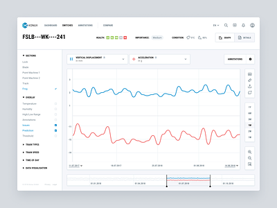
Here’s a look at some data visualization when viewing a railway switch with the tool.
View the case study.


