Working for Exposure

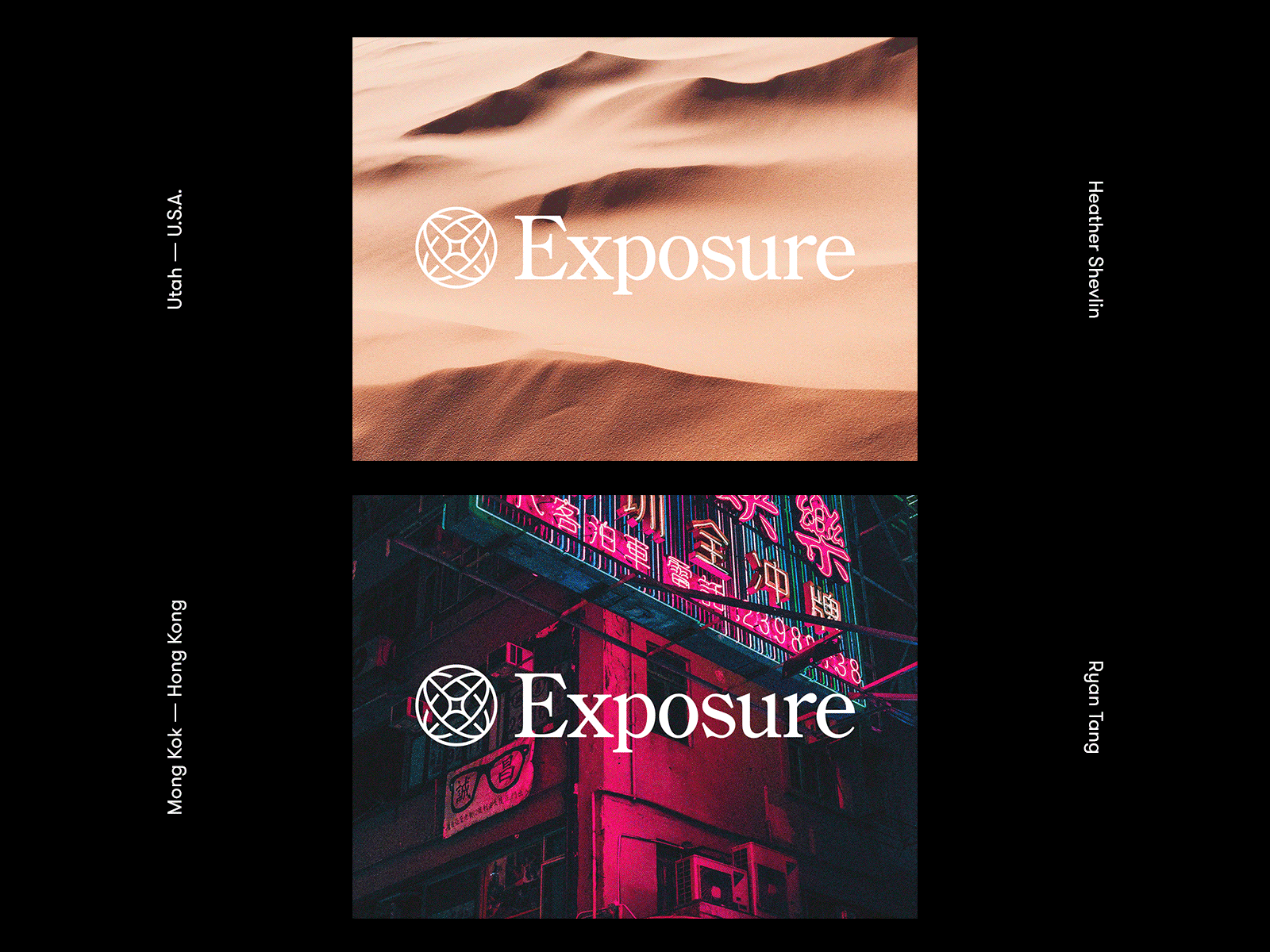


I'm so excited to finally show off this full identity for the photography/storytelling CMS called Exposure.co. Check out the full case study on medium↗
This project was one that was close to our hearts because this is a product that we actually used. So we really wanted to go the extra mile to make it feel special for everyone that uses it.
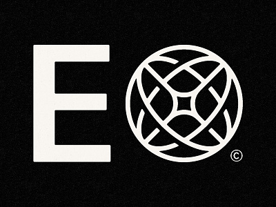
Here's a little break down of what the symbol itself represents:
Ex 1. The exterior globe shape visually represents the fact that Exposure users come from all over the world and travel all over the world. Their platform is a beautiful window into so many places that we felt it was something that should be incorporated into the identity.
Ex 2. The X in the middle connects everyone and provides a global perspective. It’s also represents a star or a flash—a subtle nod toward Exposure’s photography roots.
Ex 3. The heart in the mark is there because without these folks putting their soul out there and showcasing their photos from their everyday lives, mountain climbs, cycling excursions, humanitarian causes, city strolls, intense sporting events, Exposure wouldn’t exist. In every story there is life, there is heart. We were just looking to squeeze in a little bit of humanity to a purely geometric mark.
We tapped our buddy Justin Lawes to do the logo animation and honestly I couldn't be happier with how it turned out.
I hope you dig it and again here's the link to the full case study.