Monk-ID - Logo Concept 4 🟠

MONK-ID - Logo Concept Part 4. 🟠
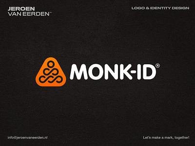
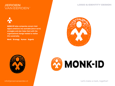
MONK-ID helps companies convert their digital ambitions into workable (short-term) strategies and also helps them with the organizational change needed to realize this sustainably.
My goal here was to find something balanced, organic, and strategy-related. Hence the two axes forming a letter M but also the Monk's body. While using the letter O as the badge surrounding to compliment each other. Adding a bold texture gives this a unique-looking identity perfectly matched for this client.
Happy to hear your thoughts and if you ever seen something similar before. Some of my personal concerns where that the body may remind a little of a judo fighter, but kinda feel the idea of an actual monk makes more sense here. Anyway, would love to hear your thoughts and points of feedback if possible.
Thanks and have a great day!
___
Want to work with me and create a mark, together? Feel free to reach out via my E-mail or Dribbble DM: