Daily UI #002 - Credit Card Checkout

Daily UI Exercise - designing a credit card checkout screen.
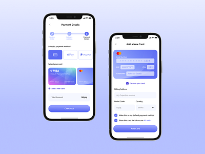
Checkout process requires lots of information from a user. I categorized the process into three different steps (Review order, address details and payment details) so the user can focus on one at a time.
In the "Payment details" screen, I used images that resembles actual credit card, so it's visually more relatable to user that he/she is actually using his/her card (visible interactive element). Also placement of credit card logo, credit card number and expiration date is similar to the card in real world, so that the users intuitively know what each numbers on the card represents.
In the "Add new card" screen, user can conveniently tap on "Or scan your card" button to avoid typing card number using a small keyboard on mobile. Also categorized input information into 2 different categories: Actual card info and billing address info. Input for actual card info is presented on a card-like background, and billing info below the card image.


