


Summary of Bank Transfer (Checkout Page) Redesign

Hello everyone, we're back again (after long time ago) 😅👋🏻
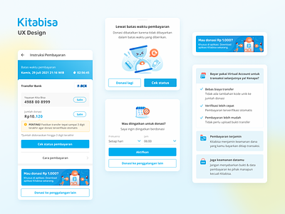
First you need to know the story of our users and our objective for this design (new manual transfer summary / checkout page).
So, when a user is opening the manual transfer summary page, the user wants the process to be faster and want to be easier to scan more important information such as unique number, and payment status check. So that they can complete their payment process faster, with a higher success rate.
Here are some improvements I made to give a better experience.
Less is more. I keep the summary page simple and it will look and feel easy to navigate.
-
Added a countdown, this will make users to make payments immediately because time is very limited.
-
Education for users so that future payments use faster, easier and more efficient payments.
-
Ensuring users to focus on payment information and the amount of the donation along with the unique number.
What do you think? Let us know by leaving a comment below
Kudos to the amazing team below 💙
UI/UX Designer: Bung Momo
UX Researcher: Aprillia
UX Writer: Shafa Sampow
Illustrator: Wyanet F Paramasanthaty
Product Manager: Bara E Brahmantika
Manager: Yasir Mukhtar
and of course Engineers & another team.


