GiveForms Navigation


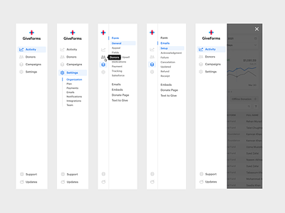
Navigation is one of the most basic, yet important elements to nail in your app. I'm working through updated navigation for GiveForms and jotted down a few rules I tend to follow.
-
Name Consistently - If you use a single word for one menu item, try to use a single word for all. Doesn't always work, but it's beautiful when it does.
Use Restraint - Don't create decision fatigue by putting 30 links in your top level navigation. As a general rule—the fewer the better. Keep top level menus to a max of ~7.
Triage Empathetically - Understand what's most important to your users, then make sure these features are a click away. Sort menus based on usage and importance. De-prioritize less important features to secondary or tertiary navigation.
Words Matter - a wrong word can be the difference in just "getting it" and a support ticket. I ask myself "how can this word be misinterpreted?" If I can think of a few answers, there's work to do. Power Thesaurus is a great tool if you're stuck.
Created at Dreamten


