Data Visualization

Hello,
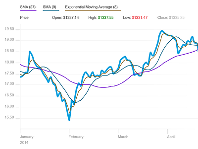
Here on this shot, I've tried to maximize the data to ink ratio in this chart. I obviously do not work with ink but I'm quoting Edward Tufte.
Charts present data simply and clearly by deemphasizing and regularizing non data pixels.
Regularizing non data pixels means reducing distraction by consistently muting these pixels. When used effectively color can highlight the most important data. Color must always be functional, not decorative. Placing the y-axis values on the left and key info at the top of the chart seems more natural.
The top-left region is an area of great emphasis due to the conventions of Western written languages. English speaking users will most likely begin scanning the screen from the left to right and top to bottom.
Please let me know what your thoughts are?
Thank You,
Russ


