Gmail redesigned
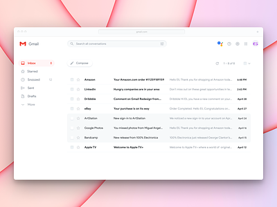
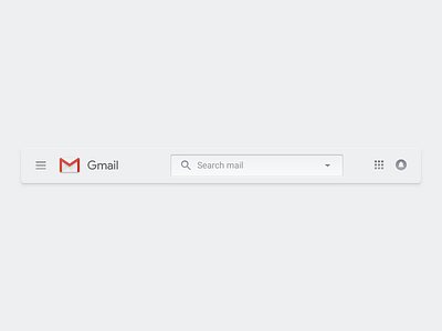
I've redesigned the Gmail toolbar before, but I hadn't tackled the entire UI, until now.
The Gmail logo is a horrendous mess. But it could work alright if it stuck with the standard Gmail red colors and were pixel-aligned. Why isn't it that way? Google designers can't make decisions because they have no authority. So everything has to have all the colors. Makes everyone happy and offends no one (internally).
In addition, the proportions of most elements feel very disjointed in the current design, instead of having clear relationships. Also, it seemed important as well to double down on Product Sans, Google's UI typeface. It's plenty legible at the sizes that appear in Gmail, to the point where Roboto isn't necessary as an accent or secondary typeface.


