Apple Maps

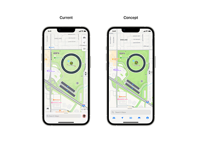
I did a small concept of Apple Maps because I'm using the app for a few days, and I'm wondering why Apple didn't follow the style of Safari, putting all the actions at the bottom to have a full experience of navigation. And it's easier for the finger to reach the actions also 👆🏼
The idea was to centralize everything at the bottom it's easier for the user to understand where they can find all the information instead of splitting it on the four edges of the screen. 📱
And finally when I switch to light mode the icons are not visible enough, that's why I chose the blue color, they have more impact on the eyes instead of grey. 🤓


