AlohaCamp - Logotype


Recently I’ve worked with Unikorns team on a branding style of the AlohaCamp – rising European start-up that provides a service for finding the campsites.
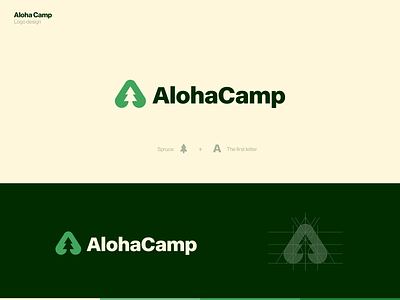
The word “Aloha” does not mean Hawaii and palm trees. It has a deeper meaning, it is a warm welcome, love and solitude with nature.
The logo is a combination of two symbols - the letter A and spruce, which gives a hint of nature.
In the next shots we’ll show you other elements of identity and style.
Stay tuned for more shots!
🌲


