Banking Landing Page


💌 Have a project idea? We are available for new projects info@ronasit.com | Telegram | WhatsApp | Facebook | Linkedin | Website
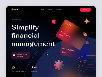
What can you do to make your landing page stand out? It's the trending look and eye-catching design for us! Here's an example of a landing page for an online banking service that will definitely attract users' attention.
The shot shows the hero section of the landing page with an illustrated banner and a marketing slogan that promotes the service completed with a CTA button to download the app.
We wanted to create a space-reminiscing look and chose for this a dark color palette of dark blue, black, and bright red. This solution follows the latest trends of dark-themed interfaces and the use of graphic elements.
This concept landing page has all the chances of catching user's attention by combining the latest design trends with a spacious and airy content structure where all the important elements stand out.
What do you think about this concept?


