A more human illustration style for nudges


Excited to share some background on the illustration style that we developed for Humu’s nudges with the super-talented Jacob Greif
Our previous illustration style leaned heavily into ocean metaphors—as in, fish in the workplace. Don’t get me wrong, I like a salmon with a briefcase as much as the next person... but after running some research we learned that this style may not be the best way to communicate to our users.
Why not? It's because so much of Humu is based on helping people understand and relate to the complexities of human behavior. While the fish characters made some of these themes more fun, they often lacked proper nuance and emotion.
We set out to create a flexible style that was more:
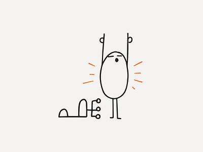
Human, authentic - With aspects of facial expression and body language that would be more emotive and weave naturally into workplace scenes. Imperfect, like people.
Universal - Characters that feel resonant. Anyone could see a bit of themselves in this style.
Focused - A style that draws your attention to the most important things. Simple, without extra noise.
Flexible, scalable - Our previous style was time consuming (and expensive) to execute. With thousands of nudges, we wanted a style that could inject plenty of visual variety and cover a wide range of concepts. Plus we could execute and extend the system with contractors, as well as our in-house team.
Getting the right balance here made this a tough project to art direct, but we were super happy with the result. Oh, and we threw a big party to launch this with the team. Gotta have stickers.
Read more about this update on the Humu blog. And be sure to check out Jacob's other work at JacobGrief.com and hire him at Jacob & Friends. You'll be glad you did 🙌


