GALBENEL

Fresh eggs
You recognize ambitious people by the dedication and passion that they put in following their dreams. Galbenel became in a very short amount of time a farm of laying hen built from the blade of grass to a modern and brand new business.
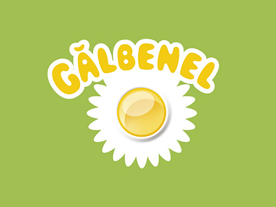
The Galbenel egg draws a whole world in its logo: fresh wildflowers and a nourishing yellow-orange core. And the name, of course, was inspired by the eggs’ colour which is familiar to those who know how to recognize a high-quality egg.
The whole project started with the brand strategy and it continued with the name and the descriptor and then later, with the conception of the visual identity, the transport fleet, the applications, the communication materials and the manual of design and brand standards.
See full project on our website.


