Spotify Music and Podcast App Re-design 🎶

Dribbblers, helloiiiiiiiiiiiiiiiiiiiiii 🙋♂️
Spotify is the most popular and well-liked music and podcasts app available in the app stores. There are millions of music and podcasts available on Spotify. 🎵 🎧
I'm a Spotify member, and while I don't have any complaints about their current UI/UX, I decided to redesign it simply for fun. I tried to put my own spin on their existing UI/UX, and the result is here!
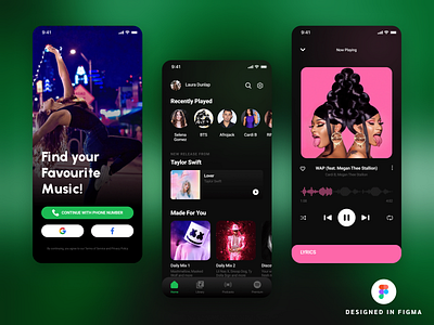
My objective was to retain the UI of my vision as close as possible to the original, but with a personal touch. Because I dislike the present bottom navigation bar, which is a fading navigation bar, I chose to make my vision a gradient bottom navigation bar. In addition, I decided to include a separate podcast icon to direct users directly to the podcast. 🎤
The most significant and risky modification, however, is to replace the same old boring timeline with an Audio Spectrume Timeline, which will change colours based on the album/song cover. Some may wonder why such a dangerous act is being done. So the explanation is that users are already accustomed to the typical timeline in all music apps, and Audio Spectrume, while not novel, is visually appealing and engaging. Some individuals will enjoy it, while others may believe it is unnecessary.
~~~~~~~~~~~~~~~~~~~~
Thanks for your time ✨
If you like my vision then don't forget to press "L" on your keyboard 💜
Follow me to stay updated with my work! 👌
~~~~~~~~~~~~~~~~~~~~
👉 LinkedIn: https://www.linkedin.com/in/divyansh-bhatnagar-84b0b8153/


