Stir: Iconography


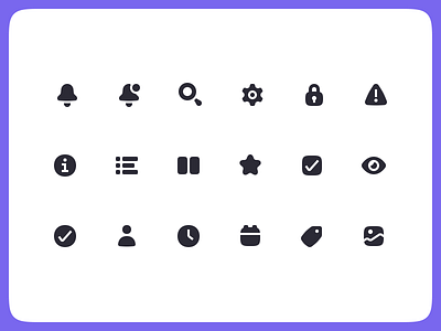


As a functional piece of the UI, Stir’s icons borrow a lot of their architecture from other components and brand elements: colors, rounded forms, stuff like that. But they're also often paired with typography—so we wanted to make sure that aesthetically, they can provide a bridge between all those different pieces.
So we dug into the type anatomy a little bit—and like a lot of grotesque typefaces, our letterforms are built on elements of the superellipse. This particular flavor of superellipse—more commonly known as a “squircle”— can be seen every day as the bounding shape for most app icons. And it’s something we used as the basis for most forms in this new set.
For the navigation icons, you'll notice each icon's form has been made of at least 2 distinct pieces. The reason for this is partly for added visual interest, but also for accessibility. It’s good practice to not rely solely on a color or opacity shift to indicate focus or state change, since that kind of subtlety isn't readily apparent or can be obscured for a lot of folks. So we went ahead and crafted some unique inactive states for each of these so that shift can be much more obvious.
Shoutout to the rest of the MetaLab team that helped with Stir - @JesseJims @theposch @sammedve


