


Music App Icon Set

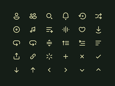
Adding personality to an icon set is tricky. I got the chance to redesign the entire icon set for an app I've worked on for several years.
I wanted to keep the soft/rounded look, but also to use sharper edges/caps. Some shapes are easier than others. If theres no curves, you end up with a very sharp, straight look. If theres no corners or caps you'll end up with a very soft look.
Fairly satisfied with how this ended up!


