Rejected Concept


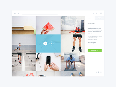
This shot shows up one of the past "pack view" concepts of the webapp we're currently working on with the Death to the stock photo team. To make it short, we want to create a fast, convenient and fullwidth photo browsing experience, especially on desktop. This UX/UI concept has been avoided and I wanted to quickly share with you why and how.
So, why isn't this design a relevant answer to the problem we're trying to solve?
1/ Readability
This photo layout is giving a compact overview which is one of the constraints I wanted to keep in mind. The global composition seems pleasant and also consistent with its various elements stuck to each others. However, if a pack is made up of photographies with various tones or contrasts, things can quickly became weird, especially concerning readability and scan.
Adding some space between photographies may greatly help to get a better readability as well as a more consistent visual look whatever could be the tone/contrast of each element.
2/ Interactions (Hover state)
The way I chose to inform people when their mouse hover a photography seems clear. Yes, "seems", because in an other hand it also seems too excessive, visually appealing. It results in reducing the visibility of each photography when the overlay is active.
Some people use to follow the part of the screen they're looking at with their cursor while they're browsing a page. In case people are moving this cursor a lot (I do so, probably because of my coffee addiction), things can quickly became busy on screen and disrupt the experience.
We do think we need something subtle yet clear without reducing the readability of our main content. Pinterest is an inspiring example of simplicity and speed using some ingenious stuff like the cursor property (zoom-in) which I find really relevant in this case.
4/ Rhythm
I wanted to try something "linear" concerning the rhythm of the grid, to keep some unity and again help with the very first scan. After a few attempts I concluded I had to add some rhythm into this layout: composing with portrait, landscape, and different sizes of photographies to create a richer "photo chaining" seems like a good point to start.
3/ Additional informations
This layout does not tell if each photography is landscape or portrait. They're all cropped to fit a fixed size into the grid and it can imply that they're all landscapes.
I tried to add some potraits (2x the landscape height, to keep some consistency into the layout) and trust me, it wasn't helping at all with scan or even the visual look. This "error" allowed us to focus on this point which was very important to define before moving forward.
4/ Usability & Features
This rejected mockup also shows up how a simple product with a few features can quickly became complex on-screen.
- Is this sidebar so useful so it constantly needs to be visible, or even needs this "big" part of the screen during the experience?
- What could be the grid layout giving the better overview regarding our content?
- Right now, we have something like 12 or 13 actionnable elements on screen. Does this coincide with our focus concerning simplicity?
- What is really needed? When is it needed?
These are typically the kind of questions we've been asking to ourselves before designing all the iterations going forward.
Since then, we've been putting lot of efforts into improving the whole experience (and are still working hard on it).
If you were courageous enough to read this until the end, I hope you found at least a few stuff useful. And I do know Dribbble is not Medium (I guess we need to combine both).
Feedbacks and thoughts are more than welcome like always. Have a nice day!
vince


