Fun Cannabis Brand and Package Design


The Brand
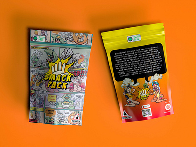
Smack Pack is a cannabis brand that focuses on high quality and strong strains that hit hard (smacks). It’s meant to appeal to consumers that are deeply involved in the cannabis culture with its colorful brand that don’t take themselves too serious.
The Goal
To create an artistic style and logo that can help Smack Pack differentiate itself from its competitors. It needs to be colorful and unique.
The Look
Inspired by 90s comic books. With the typo meant to look like a sound effect and the icon going for comic book action effect commonly associated with the format. We wanted to symbolize speed, strength, and a good time. The colors and fonts needed to match the style and feel fun and cannabis inspired.
The Packaging
To stay in the comic book realm we wanted to create an actual comic page to attract customers to the package. Nothing is more engaging than an actual story. It had to speak the language of the intended audience and its packed full of puns, terms, and expressions used by the community.
Wanna work together?
Let's build you something dope.
email us: hello@taurist.com
'Our goals can only be reached through the vehicle of a plan. There is no other route to success.' - Pablo Picasso


