Branding & Packaging Design for Cannabis Extract Company


The Goal
We wanted the logo to incorporate the S the Z and the X in their name. The client prides themselves on their quality and top shelf status.
They wanted their brand to communicate the extraction process to all clean impurities as well as their high-quality/modern products.
Since cannabis still hasn't received widespread acceptance we wanted the logo also to be subtle, it should not communicate that this is a cannabis company and instead a company that focuses on creating high quality products that serve both medicinal and recreational purposes.
The Art Direction
Due to their process of using sub zero temperatures to extract their THC the concept of cold needed to be communicated. But in the end we wanted the product (the extract) to take center stage and expand on the high quality of the brand by making it gold in color.
Three factors helped us determine the typography. Sleekness, modernity, and scientific process. A sleek font helps to convey the brand as a high quality brand and a monospace font with hard edges shows that they are scientific in nature and gives a sense of thoroughness.
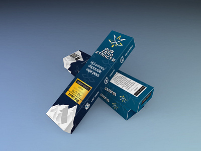
The Packaging
SZX plans to sell their products directly through dispensaries and similar vendors. With the launch of their Disposable pens they tasked us with the job of designing their packaging. We went for gold labels and silver lettering to better communicate its high quality. The mountains at the bottom is a reminder of their sub zero temperature process of high quality extraction And the overall look and feel of the box is to position their product as a modern brand with a commitment to excellence.
Wanna work together?
Let's build you something dope.
email us: hello@taurist.com
'Our goals can only be reached through the vehicle of a plan. There is no other route to success.' - Pablo Picasso


