Vesta Architecture

I rebranded a local architect - vesta architecture, I designed and built her a new website running on wordpress.
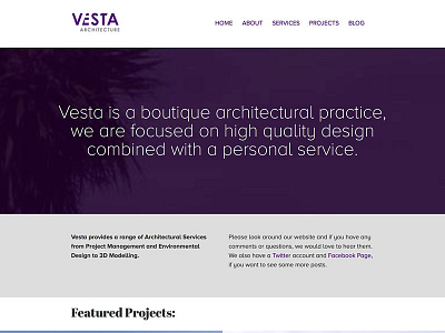
The purple was used as the only real link between the old brand and the new. For the logo, I wanted to really portray geometry and give feeling of structure. I read a beautiful quote about architecture, and how it is actually the space between the elements, where architecture lives. So with that in mind, I wanted to modify the type to feel like the V and E are working together to create something new.
I kept the typography for the site simple - just two fonts: Proxima Nova Alt and Abril Fatface for contrast.
You can see the full site here: http://www.vestaarchitecture.co.uk


