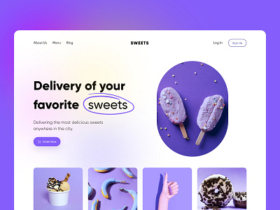
Pantone New Color Of The Year 2022: Very Peri
UI is a special kind of art, and color plays a key role in it. With the help of color, we add brightness to the interface, convey mood and emotions. This is a great example of how the interaction with the user takes place on a visual level.
Color has a particular impact on how a product will be perceived, on how recognizable a brand will be and what it will be associated with.If you’re looking to create trending designs, check out the selection of the leading color expert - the Pantone Color Institute. The primary color of the upcoming 2022 is lilac 17-3938 Very Peri.
The creators described it as: «Encompassing the qualities of the blues, yet at the same time possessing a violet-red undertone, PANTONE 17-3938 Very Peri displays a spritely, joyous attitude and dynamic presence that encourages courageous creativity and imaginative expression,» says Leatrice Eiseman, Executive Director, Pantone Color Institute.We decided to keep up and play a bit with the new 2022 trending color, adding a few new shots in different shades of Very Peri to our Dribbble portfolio.
Hope you like it 😍
Leave your feedback on the comment and don't forget to press "Like". Thank you!
--------------
👉🏼 You can find us here: groupbwt.com | Behance
✉️ Would you like to hire us? Say hello at hello@groupbwt.com


