Man on the Moon: Brand Identity

This one's out of the archives!
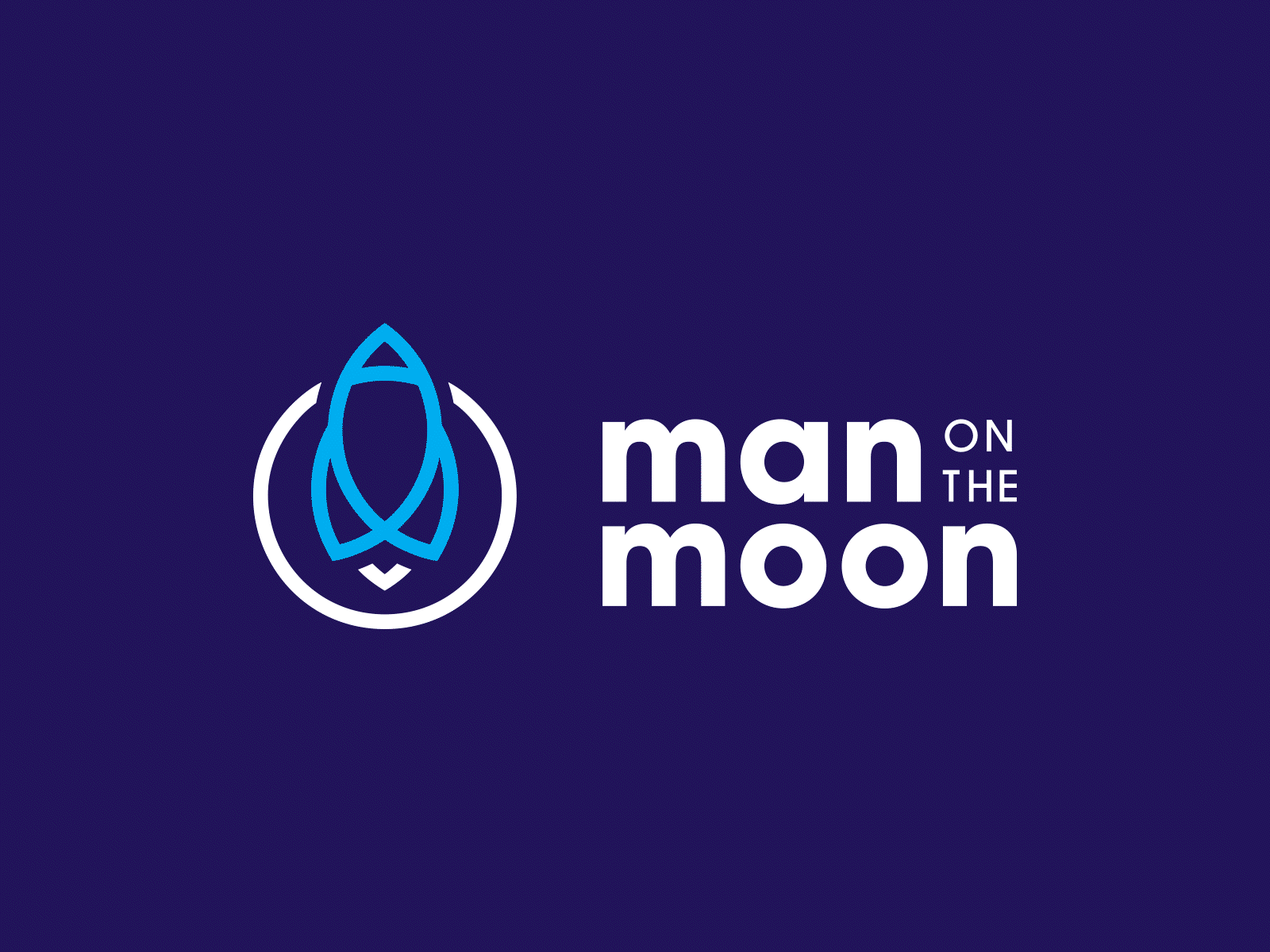
This logo was part of a brand identity project where the brief was to create a brand identity for a design agency who served those who sought to launch their brands to the moon.
The inspiration behind the idea for the name of the agency and the brand was of course, the world-changing event of the first human stepping onto the moon. It was an event that connected millions of people together in a shared experience, and filled many with hope and imagination for what the future might hold.
And, to be honest, who doesn't want to go to the moon?
Hence, Man on the Moon was born.
The logo icon was constructed using circles. This wasn't done only because the moon is round, but the shape of a circle represents continuity and connection, and resulted in a symmetrical and balanced icon. Elon Musk ain't the only one out there who can build rockets these days...


