Booking app check-out

Hi there! A quick look at a redesign of a IHG hotel booking app.
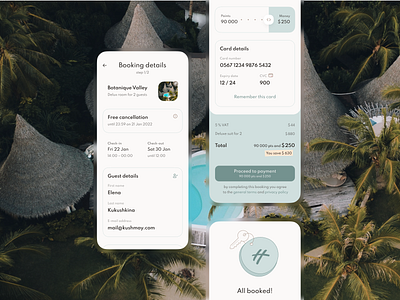
My goal was to simplify the check-out flow as much as possible. Therefore I highlighted only essential info and hid the rest into the links and buttons.
As we researched, the most confusing part of an IHG app was a points system combined with money. So I thought if the amount I pay depends on the points I spend, these two attributes should be visually combined either. That’s how a slider ‘Points — Money’ came up.
Also, I highlighted the amount of saved money, to emphasize the value user gets by being a member of a loyalty program.


