Information Cards - Tips

Hey all,
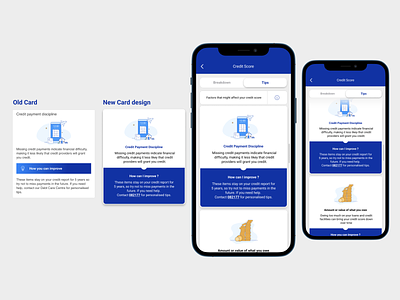
Sharing my proposed “information card” for standard bank. As I was going through their tips journey I found that there are some enhancements that can be made to their information cards.
Here is what I found from their card design:
- Information Hierarchy not clear ( I felt like their heading in the card got lost as it was placed far in the corner. It didn’t give much meaning to the text inside the card) - Poor affordance (I tried clicking the blue box written ‘how can you improve’, I found this problematic as it confused me to thinking it was a button. - Overall I liked their icons and colour usage. I was not to mad about that at all.
Here is what I changed:
- I applied the belt and suspender rule. Keeping my font the same size and bolding the text to create visual hierarchy.
- Brought my heading closer to the text and giving closer context to the copy it supports.
- From a visual perspective I applied gestalts law of connectedness. Which allows you to see the information in the card as one.
I didn’t want to spend too much time on this but I thought this would do the trick.
Check me out on LinkedIn: https://www.linkedin.com/in/neo-mphahlele-b07621122/


