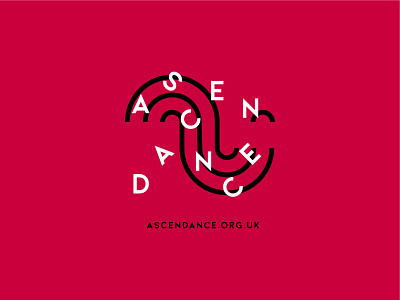
Ascendance
This bold, fun branding originated with the idea of a wave. I created an abstract pattern from conjoined lines and circles. It was also a nice touch that, from the pattern, a smiley face emerged. This is what formed the logo symbol 🙂
The two themes of a continuous, repeating wave and the smiley face just seems so fitting for Ascendance and the community work it does—lifting people’s hearts and minds through dance!
brandidentity
branding
brandstory
brightbranding
colourinspo
dancelogo
dancewithparkinsons
design
logo
logodesigner
parkinsons
tshirt
tshirt design
View all tags
Posted on
Feb 11, 2022
More by Sarah Kirkbride View profile
Like


