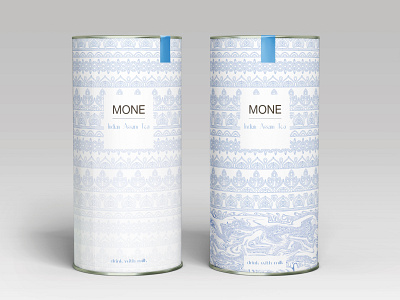
Tea packaging design MONE Indian Assam Tea
The main task was to create a branded tea package with an Indian theme. It was also necessary to indicate that tea should be drunk with milk. Therefore, the Indian ornament was used in the project. Why was blue used? Because it was Indian porcelain that was painted with blue paint. How to graphically show that this tea should be drunk with milk? On the first package, in order to clearly show that it is recommended to drink tea with milk, I used fluid art. I mixed the blue pattern and the white background. As if milk was spilled on porcelain and everything mixed up. In the second pack, I used a transparent to white gradient. Like tea, it acquires shades of white from the milk added to it. Why are these packages trending? Because most of us have associations with tea drinking, especially from porcelain cups. They were with our parents and the older generation. Therefore, we remember them from childhood. Trends adapted to our memories. Therefore, this package will make us remember them.
Also, the design of this packaging is included in the 2020-2022 trends of WGSN - a trend forecasting company.
Trends 2020-2022 WGSN
Trend: Home Spun. Porcelain
Details:https://www.behance.net/gallery/127399521/Branding-of-tea-packaging


