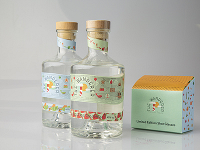
The Wanderer

My client is producing a fun, energetic, and playful tequila. My reason for
choosing this client is that I wanted to push myself to work on colourful and
playful designs, instead of the structured work I usually lean towards. The
client aims to produce an affordable craft tequila, and the product will be sold
mostly at events and festivals.
My target audience is a younger person who is adventurous, and enjoys
spending time with their friends and their family - likely in smaller groups.
They prefer comfort over being flamboyant, and they are also likely creative.
The Brand aims to create a sense of comfort, and adventure with the
audience, while still being lively and playful. The brand also needs to feel
warm, and modern while also making the audience nostalgic.
My concept focuses mainly on pirates. There’s a lot of misconceptions
surrounding them. I focused my research on the positive part of being a
pirate, and their adventures. I also focused a lot on what they consider to be
good omens.
At first my visual approach was to create icons and make a pattern. While
I still incorporated this idea, I changed to working more with the idea of a
treasure map, and incorporating lines as a way to add texture and pattern. I
used icons that best represent pirates, and also included some of the good
omens they believe in - St. Elmo’s Fire, St. Clement’s cross, Cormorants, etc.
I used colours that represent the flavours, and also incorporated icons that
represent the flavours.


