Case Study - AWeber Message Center

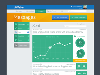

This case study highlights a potential update of AWeber's messages interface. It grouped everything in a smarter easier to navigate way, it also used color to convey which section you were in.
This case study highlights a potential update of AWeber's messages interface. It grouped everything in a smarter easier to navigate way, it also used color to convey which section you were in.


