


Reminders - Chopped and Screwed


*See attachment for a comparison
I know what you’re thinking. “Here’s yet another wanker on Dribbble making a superfluous redesign of an iOS app.”
I shouldn’t spend my Sunday redesigning Reminders, I should be having brunch and sleep off my hangover. But here I am doing someone else’s job..
Why care abut Reminders when there are a billion other to-do list apps that has more features and a prettier UI? Well, even though looking like hell, Reminders is pretty useful. It’s comes built in on all my devices, always stays synced and doesn’t include any fancy pansy hidden gestures. It’s a simple to-do list, light weight, just as I like it.
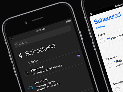
It’s just too easy to do a quick fix. Small improvements to typography, margins and colors can actually turn into a decent looking app. Remove that god awful texture, adjust the line height, realign some elements and increased the margins (without using too much screen real estate), and the whole UI goes from a cluttered beige mess to something that actually deserves to live in iOS 8.
And how weird is it to search for items on a “paper” card? Why not just use the card metaphor for your lists only (where it’s fun and makes sense), and make a clear distinction between the app’s primary function; To-Do lists and it’s secondary functions; Search & Schedule. – Mmmm.
Anyway, time for me to stop whining and go back to crying in the shower. Ahh, I love Sundays.


