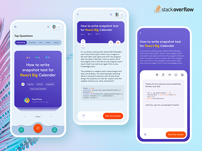
I put some stacks in StackOverflow mobile view


Hello Creatives! 😀
StackOverflow is one of my most visited site. The mobile responsive UI of it seems messy to me. Focusing issue by issue is daunting there. So I thought if I can browse StackOverflow issues one-by-one! Here came the idea to design ui where user don't scroll, rather browse the issues swiping left and right. 🤩
It's just an exploration. Feel free to give me your kind feedback which can be improved here.
--
I like to learn user psychology and behavioral science. So, I share in every shot as "ShotNote" about what I think about specific issue. Please correct me If I am wrong, or suggest me what I should know or read!
--
ShotNote 2 : Why Less-is-more matters in UX, too?
According to the universal principal of design, psychology and behavioral science, the less option you give someone to choose from, the earlier the choice made! It’s known by smart brands like Apple. But how does it matter in UX design?
1. Cognitive load and number of options.
Our brain takes around 4 million input per second! Maximum of them it doesn’t register in its temporary memory or working memory (RAM). It only register 4 inputs to process at a time.
When we show users more than 4 options; like 6-7 input box at a time to grab data, many product suggestions or something like that, it creates Cognitive load and user feels anxiety, resulting throwing the task altogether. So, not giving maximum 4 options at a time is good UX. Apps like AirBnB, Uber etc. never ask for more than 4 information at one state, rather it breaks the steps into several
subsequent screens.
2. The contrast effect
Suppose, in a ceramic shop, there are two sets of ceramic sets.
Set number ONE consists of 8 pieces in total and another one, set number TWO consists of 10 pieces but one of the piece is broken. Price of both of the sets is SAME.
Which set you want to buy now?
The experiment conducted by Brilliant researcher & psychologist Daniel Kahneman (Author of - Thinking Fast & Slow). The result was surprising and which broke conventional economic rules.
Most of the subjects chose the set ONE consisting on 8 pieces while they can get more in buying set no TWO because, after a broken piece, it still consists of 9 pieces, 1 piece more than set ONE.
It turned out that, people did not consider the number of pieces in each sets (8 vs. 9), rather thy considered that ”One piece is broken in set number TWO”! And that’s the problem of showing more or irrelevant options. If the broken piece was removed form the set, surely set number TWO would be the best option.
So, we should not show options that are not necessary in any screen because that ma drive user to take irrational decisions.
3. Each irrelevant word cut down relevancy of equally relevant word.
It’s a principle of the Typography, too. As this principle says, we should not put any word in a content that does not needed or relevant to that context. And if we do so, it will cut the proportional relevancy of relevant one.
So, in a given moment, If we can explain the context by as less as 10 words, we should not put any additional word/s. If our one additional word results in 11 words, we now actually have 9 words (10 - 1 additional) ! Which is insufficient to explain your context.
For any suggestion of correction, please mention me in shot comments!
--
Hello 👋 I am Mafruhur Rahman, an UX designer experience on making design systems, mobile apps, futuristic experiences.
Currently open for projects & remote positions.
Say me hi at mafruh.faruqi@outlook.com
or Skype at live:mafruh.faruqi
Peace! ✌️


