


WWE Survivor Series Poster

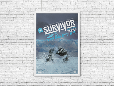
The concept of this poster was derived from last year's 'Man of Steel' film. Roman Reign's recent injury, the inclusion of the word ‘survivor’ in the event’s name along with one of his signature moves named the superman punch really sealed the deal when thinking of a theme for this month’s pay-per-view poster.
I started re-creating the Survivor Series logo using Illustrator and tweaked to illustrate the look and feel of the poster's concept. I wanted to make sure I stayed with two colors max for the event’s name, but came across an issue with the date and time blending in together too well when stacked to the point where you would get lost when reading all the details. I overcame this obstacle by slightly bringing down the hue of the color blue in my color palette which helped seperate the sub title from the date and time.
I wanted to give the impression that Reigns had just survived (pun intended) a brutal fight while furiously punching the ground causing the ice to crack and ice particles to fly toward the viewer. I added some details on Reign’s back and head and tried to give the impression that it was being dusted off and flying off in the wind. It wouldn’t be a super hero poster without a lens flare tossed in there, would it?
Created in Photoshop and Illustrator.


