


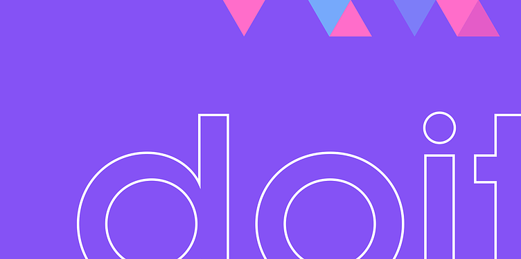
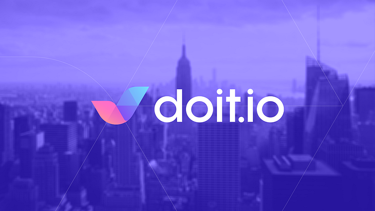
Doit.io - Branding , Identity & Logo Design


Doit.io - Branding , Identity & Logo Design
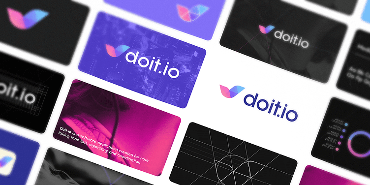
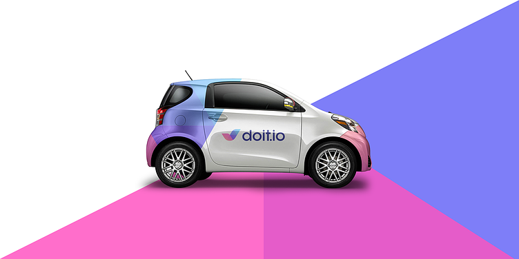
Doitio is a note-taking, to-do-list, organizing, and coordination software program. As a software program that is largely reliant on technology. Doitio need an identity that conveyed this at a look. They needed something to identify them, but also something that could represent them.
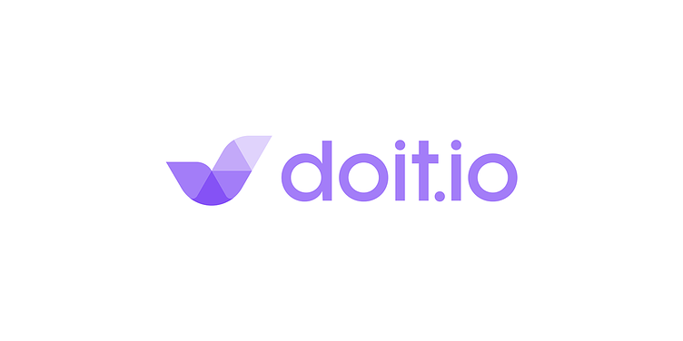
Modern, clean, and capable of working with modern technology such as websites and app icons.
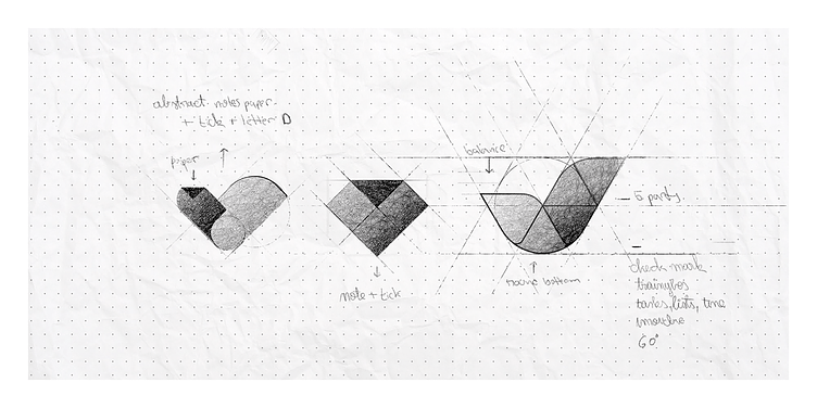
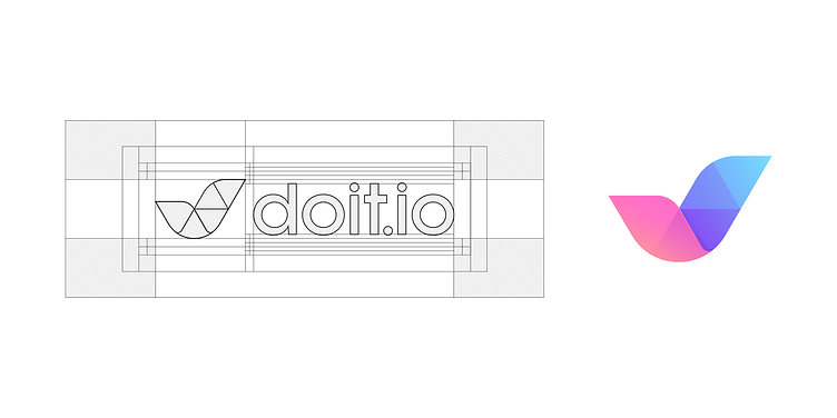
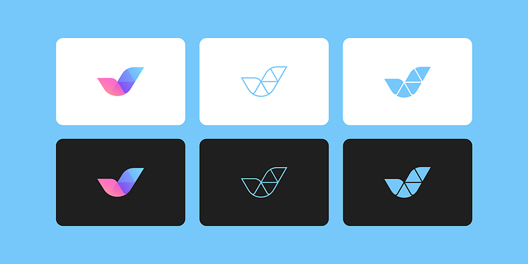
Doit needed to express what they do; their name already says something about them, but they needed an icon to do so because the name wouldn't be utilized all of the time. After an long phase of research and exploration, the " Tick " was chosen as their brand mark to reflect their brand values of innovation, friendliness, modernity, discipline, and devotion. The mark is made on a grid divided into five portions, each of which represents a particular assignment, with colors ranging from cool to warm to symbolize the task's deadline.
Get in touch with me:
contact@secondeight.net — www.secondeight.net — Instagram — Behance


Let me know your thoughts?!
Thanks!
Get in touch with me:
contact@secondeight.net — www.secondeight.net — Instagram — Behance


