Input field components — Untitled UI

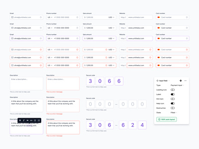


A few examples of input field Figma components and their corresponding error states. Made with super-smart variants, 100% auto layout, and hover and click interactions.
Input fields allow users to enter text into a UI. They typically appear in forms and dialogs. Pro tip: input fields on mobiles should be at least 16px text size to avoid auto zoom on most mobile browsers.
✨ Made with Untitled UI ✨
—
New post every weekday on Twitter + free assets on Figma Community.
Untitled UI • Himalayas • Webflow • Dribbble • Twitter • Figma • Website


