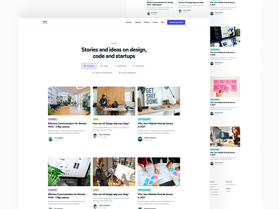
Clean Commit - Blog Redesign
You’ve been searching for answers on Google to a question about your website for 20 minutes without much luck. Finally, you find an article with an excerpt that sounds like it might be the answer you’re looking for.
You’re sceptical at this point because you’ve already tried a dozen websites. You click on the link and the website loads.
Uh-oh. The site is all over the place. The text is way too small and some obscure font that reminds you of comic sans. There are ads all over the place, and you cut your losses without bothering to read the content.
This isn’t just a story to make a point, it’s something that all of us have experienced. There are infinite articles on each topic, so if a blog’s design adds any friction to the process you can smash the back button and try the next result.
Our team spend a lot of time writing content and the last thing we want is for our site design to have a negative impact on our visitor’s ability to read what we’ve written. For that reason, we’ve recently added a handful of tweaks to our blog’s display.
Changing our font from Wotfard to Inter lightened the body text weight, improving readability. While restructuring the content layout on the archive page makes it easier for users to get a 10,000 ft view of the article before they commit to opening it.
Check the finished product out here
Tips for a great reader experience:
✅ Archive page with 20 - 30 word excerpt
✅ Font with light, easy weight for reading
✅ Tight, central content column (like Facebook, Twitter, IG)
✅ Minimal distractions besides content and images
✅ Consistent and standardised feature images


