Dreicast - case study


Abut the client
Dreicast is a live streams company from Zurich with strong background in video production and digital marketing. They show other organizations that video events are not reserved only for big tech companies. Dreicast wants to promote hybrid events as a golden standard in communication with audiences in the digital era.
How we helped?
As a part of the rebranding process we wanted to estabilish the brand's personality and build a consistent design language which could be used throught different mediums. We created a solid but also a fresh look with strong influence of the Swiss design principles to make Dreicast seen as an agile and reliable brand.
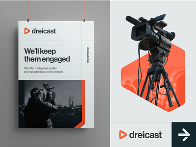
First of all we started with the logo design. It’s left part is loosely alluding to the video port shape while as a whole the triangular mark is associated with the “play” symbol. It also resembles the capital “D” letter. An interesting detail of the logo is the letter “i” cut at an 30° angle. Similar practice will also appear later in the brand's visual communication and it reffers to the technical aspect of the video industry.
When it comes to the colors we decided to take a shift from the existing corporate-like and toned down image for a power look with a vibrant orange as a brand’s distinctive color.
The estabilished visual system uses contextual photos from the events as well as the pictures of the team as an element of brand imagery. Photos are kept in the black and white or are treated with sort of a duotone effect using the brand color palette.
___
What do you think of the overall look of this project? Let us know in the comments! Remember to hit "L" if you love it 🧡.


