


Kaleidoscope

Worked on a new app icon for kaleidoscope.app.
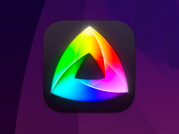
Really loved working on this icon refresh of everyone's favourite comparison app. The goal was to refresh the (already excellent) Penrose triangle prism that's been part of the app's branding since the beginning.
We wanted something more vibrant and dimensional for the update.
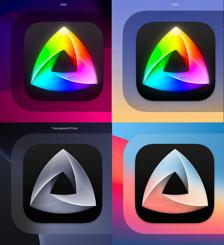
We experimented with transparency in the macOS icon, exploring the idea of letting the wallpaper bleed through both the squircle background and the prism itself. We settled on a 60% background, for that subtle colorisation from the user's wallpaper. Such a neat little detail.
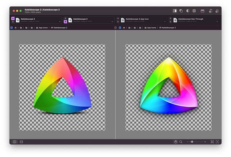
Seeing as the main concept was already established, the process was that of iterating on the exact rendering: The level of detail, rotation of gradient and opaqueness of glass. Everything I love about making icons rolled into one intersecting impossible colourful triangle.
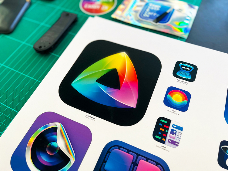
And yes, I also did an iOS version just to feature the new icon in the appiconbook.com 😍
💎 Need an icon? Shoot me an email 📩 desk@pixelresort.com
___
Get My Industry Standard Design Resources at 📐👉 applypixels.com Premium Evolving Icon & UI templates (& a bunch of freebies)


