Features

Spot illustrations for B2B Fintech Company
At first, these assets need to be responsive and therefore we need to create detailed and less detailed versions of them; with different concepts but still deliver the same context.
Ideate
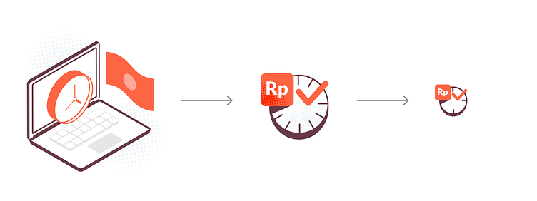
With the tight deadline, created the illustration step forward before the final copy was ready. My starting point is the keyword that wants to deliver and then develop the concept from the ideas.
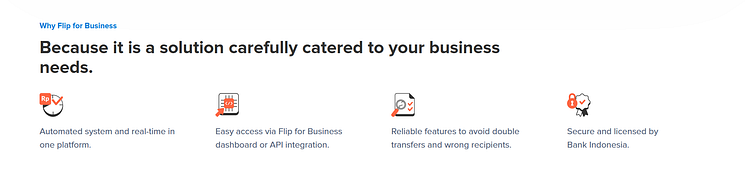
For the 'Real-Time' keyword, I want to emphasize a more direct way to visualize the time; a clock ⏰
And the final copy is - "Automated system and real-time in one platform."
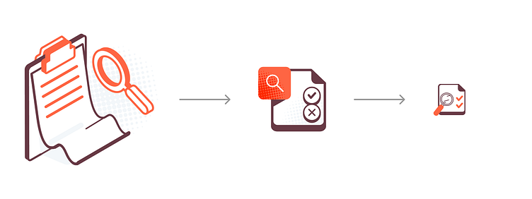
🔎
"Reliable features to avoid double transfers and wrong recipients."
🔒
"Secure and licensed by Bank Indonesia."

🧠
The last keyword is API (Application Programming Interface) - I don't know yet for sure what is that. Having a moment of desk research so I can portray the key visual (API icon) that will look familiar to the user or the community that using it.
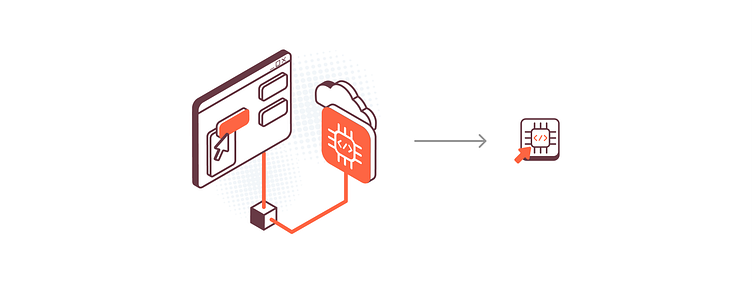
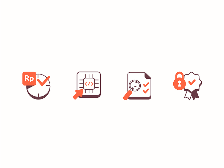
And here's the (final) live version on the company landing page; decided not to use the flat isometric version because it is good to look plain and clean ✨
💎 Thank You! 💎
Find me on Instagram
📧 email: aishaahya1@gmail.com
Feel free to drop your feedback or questions!
*This Case Study is my personal approach for the project in the company I'm working for. Absolutely, it might be different with your case. Wise advice to not take this case as a standard for you to make any decisions on your design. I'm still learning, will update this if I find something interesting in the future 💡


