Case Study: Woofgang Pet Care App

Diving in to product design with Dribbble
I created this app as part of Dribbble's 12 Week Product Design course in spring of 2022. The directive was to design a dog walking app using Figma, from the very first research and concepting through a finished, testable prototype. Read on to learn more about my concept and approach. 🐶
The Problem
Dog owners often need extra help taking care of their pets. Owners have a whole range of scheduling needs - they may be working from home full time, commuting to an office, or have constantly changing work and travel plans that make their schedules unpredictable. No matter what their situation, every dog owner wants to know that their pup is in good hands while they’re not home. Whether they need boarding during a two-week vacation, or just a quick walk in the middle of a work day, every pet owner needs to feel safe and confident in the person looking after their dog.
The Solution
Woofgang is a mobile app that helps dog owners find pet care providers to add to their personal “care team” of trusted pros, and then book and keep track of services with these providers. Users can base their search of pet care providers on global ratings, but also on ratings and recommendations from friends and mutual connections - as well as filtering for many other factors depending on the user’s priorities. The app encourages messaging and meeting in person before hiring a new person, and then continuing to hire that same person long term. Users can book services, keep track of their upcoming schedule, get updates and reports back from each service, and pay their pet care provider all through the Woofgang app.
The Big Idea: Trust
In designing the Woofgang pet care app, my most important goal was to emphasize trust and building relationships. My concept was that users would build a team of approved pet care providers whom they then book with to schedule walks, sitting and boarding. The design focuses on building long-term relationships with pet care providers, as opposed to prioritizing on on-demand or one-off services. My goal for the visual design of the app was to strike a balance between cute and fun - this is an app for owners who love their adorable pets - and calm and streamlined - to communicate that the services provided are taken seriously, and to ensure that the experience for the pet owner is easy and not visually overwhelming.
The Process
My approach to building the Woofgang app began with understanding my user and their needs. I explored the existing competition and interviewed dog owners to determine whether these apps met their needs, what their pain points were, and generally how they went about finding and booking pet care.
Market Research
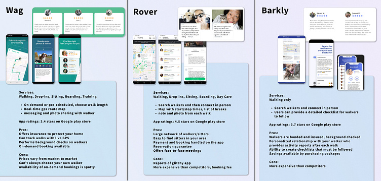
I explored several existing pet care apps, tested their functionality, and read reviews of their services. My main takeaways:
Pro: insurance and background checks
Pro: activity reports from walkers, GPS tracking of walks, photo sharing and messages from the walker
Pro: ratings and reviews of pet care providers
Con: high cost, booking fees, variable prices
Con: owner can't always choose their service provider
Con: most apps don't allow browsing before going through a lengthy onboarding and setting up a complete profile
User Research
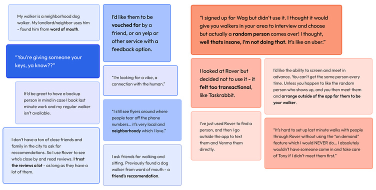
I interviewed four dog owners to learn about their experiences with pet care on and off apps. A majority of my interviewees did not use apps like Rover or Wag, but instead had one, or sometimes two, pet care providers that have been personally recommended to them. Several interviewees had used an app to search dog walkers and read reviews, but then would meet in person to decide if they liked the walker. They would book services outside of the app by texting and paying cash or Venmo.
Most interviewees were mainly aware of the on-demand walk features of the apps (the “Uber for dog walks”), which they saw as the only reason they would need these apps. The expectation of a stranger showing seemed to color their feelings about the trustworthiness of the apps.
I pulled quotes from my interviews (see image above) to begin to build user personas and inform my larger direction for this project. My main research takeaways:
Pet owners want to vet their potential pet care provider and know that they’re trustworthy, and want to meet them in person before hiring them. No one wanted a stranger taking care of their dog.
Personal recommendations from friends and neighbors carried a lot of weight. Owners also appreciated being able to read reviews and ratings of walkers.
Owners tend to have a primary pet care provider who they call or text regularly to book services. If this person is not available, they may have a backup provider, or they may call friends and family for favors.
Owners appreciate updates from their pet care providers during and after the service.
Owners want an easy way to pay for services.
User Flow
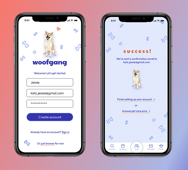
Taking into account my learnings from my research, I created a user flow in FigJam designed to quickly get a new user into the app and building their care team. In the onboarding stage, I included an option to explore without setting up an account. A user would still need to create an account and complete a profile before booking a service, but browsing the app first would allow them to start building trust with the app, and feel confident that it provides a service they want to use.
User Flow Version One
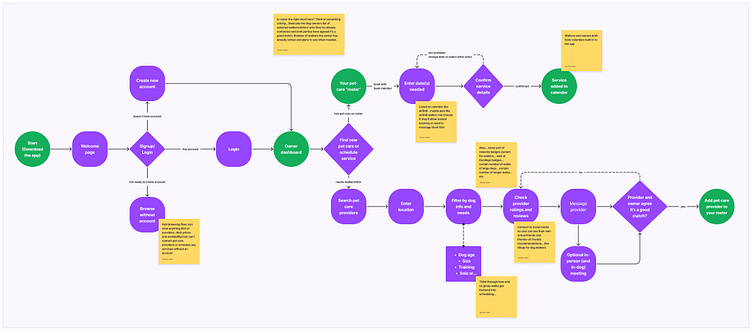
After creating an account and logging in, a user can choose to either book a service with one of the members of their care team, or search for new people to add to this team. The pet owner would enter their location and filter their search results based on their pet's particular needs. The owner can find service providers, message them to introduce, and meet in person to make sure that they're a good match. If the owner and the service provider agree, the provider can be added to the owner's care team.
User Flow Version Two
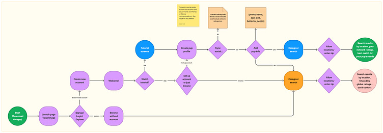
I updated my initial flow to go into more detail with the new user onboarding and the search for new pet care. In the onboarding stage, a new user is encouraged to connect their social media in order to get search results that take into account ratings from friends and mutual connections.
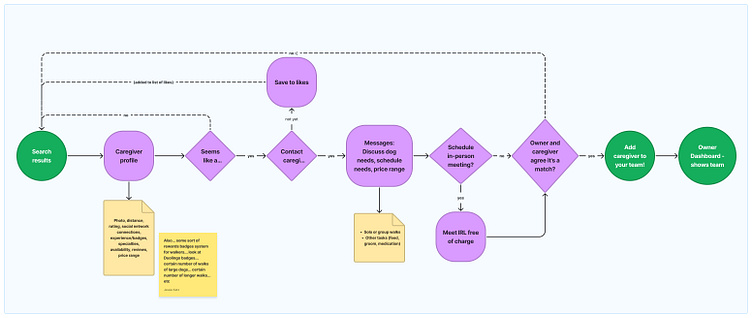
In the search flow, I added more detailed steps of how a user would go through the process of selecting a pet care provider, including an option to save a profile to a "likes" list if the owner isn't quite ready to get in touch.
Wireframing
Having created these user flows, I had a sense of how I wanted the app to function. The next step in my design process was to build the visual structure and layout of the app. I began with low-fidelity wireframes to quickly generate ideas of how the user interface could look.
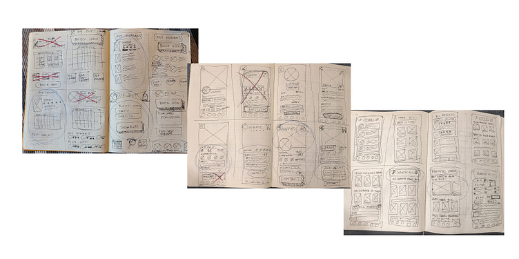
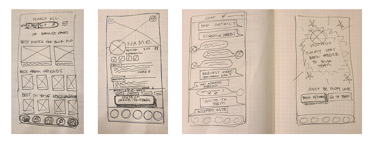
I focused my wireframe sketches primarily on three screens: a search results page, a care provider profile, and a user dashboard that would display the owner's schedule and their team members. I went through rounds of Crazy Eights to rapidly ideate on the layout of these screens, and ended up with search results and profile wireframes that I was happy with.
[A note from the future: admittedly, I never landed on a visual structure for the user dashboard that I thought functioned well, and so put that on the back burner. An important lesson that I've been learning during this process is that I can continue working through my design without getting bogged down in areas that I'm stuck. By moving ahead with other screens, I've been able to work through my larger design scheme, so now will be able to come back to this challenging dashboard screen with fresh ideas. To be continued!]
To continue the flow of finding new pet care, I also sketched wireframes of a messaging screen, and a confirmation screen.
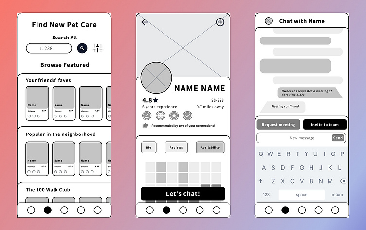
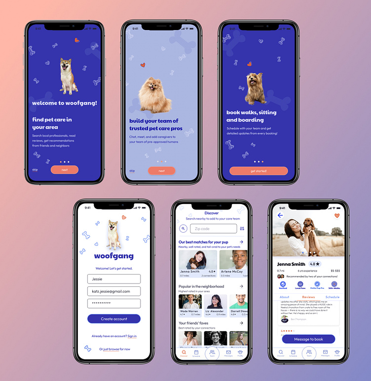
My aim in the next stages of wireframing was to find ways to visually display the large volume of information on each page in an organized way that would be manageable for the user. I structured the search results page to have a vertical list of sub-categories containing bars of individual care providers' profiles. A user could focus their search on one of these sub-categories based on their own specific priorities. In the profile page, I divided the screen into different sections to help organize up the information being communicated here. In this early stage, I styled all of these sections across all pages as cards stacked on top of each other, although later moved away from this design in order to de-clutter the screens further.
Visual Design
The First Pass
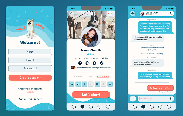
At this stage I was ready to turn my wireframes into fully styled visual designs. I chose a color pallet of light blues and coral, aiming for colors that would communicate trustworthiness and calm, but also a bit of fun. This part of my design process felt really like another round of visual brainstorming - I dove head first into design with Figma and experimented with all of the bells and whistles that it has to offer. In the end, I felt that the design was leaning too far in the direction of cutesy and silly - I wanted to pull back a bit to make the design more calm, and communicate that this is an app that can be taken seriously and trusted.
The Second Pass: Letting it Breathe
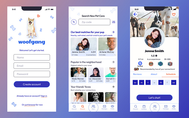
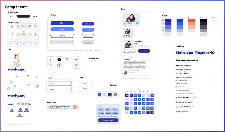
In my second round of visual design, my goal was to pull the styling back and allow each screen to feel more calm and airy. To accomplish this, I went through many edits:
I removed the waves and other framing elements from the tops and bottoms to open the screens up
I componentized my design in order to streamline and use fewer different styling elements
I simplified the layouts of my Search and Team pages. I removed the stacked-card styling and spaced rows of elements out.
I altered my color pallet and used darker blues as my primary color, and a deeper orange as an accent color. In part, this was to look less "cutesy", but more importantly, these colors have higher contrast ratios to make the design accessible to users with low vision.
While I made these edits to simplify and declutter my design, it was important to me that the app not lose its sense of fun. To remain true to the cute and loving feel of the design, I preserved the motif of illustrated dog bones and hearts, along with the "mascot" image, a dog with a big goofy smile. In clearing out some of the clutter of my initial design, I was able to actually make these elements more visible.
Prototypes and Testing
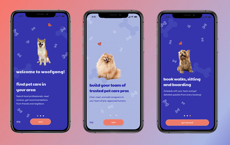
To construct a working prototype of the Woofgang app, I built several new screens to make the apps functionality feel more complete. Including an initial onboarding flow to introduce a new user to the goal of the app.
To bring my prototype to life, I added scrolling to the results on the discover page and the tabs of the profile page, as well as some fun celebratory animations on the confirmation screens. Try it for yourself!
I enlisted the help of two friends who tested the prototype on a phone while I observed them, and I asked questions about their experience after the fact.
Test 1: Observations and edits
Observation: my first tester found a few areas with broken links and scrolling. Edit: repair these for round two!
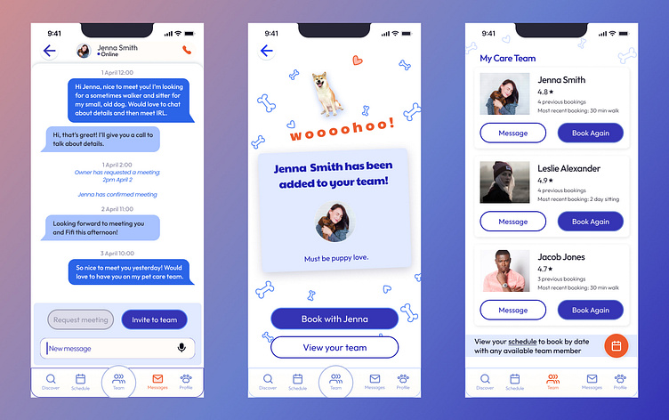
Because the onboarding flow took him directly to the search page, my first tester felt that this search page was meant to be the "home page" for the app. I was more interested in a user feeling that the Team page was the anchor of the app, so I began to think through edits to emphasize this. Edit: I adjusted the design of the navigation bar so that the Team button is in a larger circle.
On the profile page, he was inclined to click on dates on the calendar to make a new booking, which at this stage did not do anything. Edit: I added a schedule modal as an overlay to pop up when a calendar square is clicked.
The call to action button on the profile page initially said "Let's Chat." The tester ignored this button for a while until he realized it was the only option on this page. Edit: I changed the language of this button to "Message to Book" to make it clear that this is the next step in hiring a pet care provider.
On the Team page, he was inclined to click on the floating orange schedule button before he tried clicking on anything to book directly with a walker from their card on this page. Edit: I lightened the color of this button, which had been my accent orange color, so it didn't stand out quite as much.
Test 2: Improvements!
The edits that I made based on my observations of my first test proved to be steps in the right direction. My second tester had a much more streamlined and easy experience navigating the app. Improvements that I observed:
My second tester had an easier time using the navigation bar, and was inclined to use it more often.
She immediately intuited how to interact with the onboarding screens.
On the Team page, she was inclined to use the “book again” buttons on the team member's cards, as opposed to clicking on the floating schedule button.
On the Profile page, she clicked through the calendar squares and used the modal to navigate to the messaging screen.
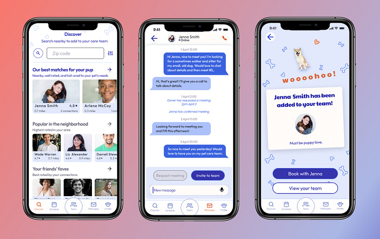
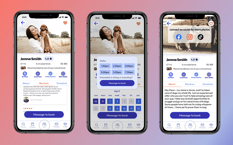
In addition to the edits I made to my prototype, I also continued to adjust my visual design. Seeing the prototype in action helped me notice areas of the user interface that could use some edits in order to communicate more clearly. In particular I worked a lot on the structure of the profile page. I removed a floating avatar image and instead added a carousel of user photos in the top third of the screen. I also added a call to action at the end of this carousel that would allow a user to see more photos on social media, in order to continue encouraging a connection with the pet care provider. I also styled the badges to better match the design of the rest of the app, and continued to adjust the layout of text blocks to be more legible.
Outcome
Looking back on this process, I'm happy with how my design has progressed. There are many more edits that I'd like to make, and many more features that I'm excited to build out, but in its current state, I believe that the design accomplishes my goal of allowing users to confidently find pet care that they know they can trust.
I found that it was incredibly helpful for me to go through multiple rounds of edits to my visual designs. The process of doing new brainstorms and ideating on alternate designs gave me valuable practice in not getting too attached to things that aren't working. I've learned several things from this project that I think will improve my work flow in the future: build out a larger number of wireframes before beginning visual design; check my color palette for accessibility right away; begin building components and using auto layout earlier in the visual design stage; don't get derailed by small details that aren't working (for example, I spent a ton of time working on styling badges that I didn't really like, only to redesign once I had a more complete overall visual design. I could have just used placeholder icons and come back to these later).
Given more time, I'd want to go back to another round of wireframing and design to come up with an owner dashboard for an existing user. Because the scope of my project focused on a new user who needs to find new pet care, I never fleshed out what this would look and function like. I'd love to build out a flow focused on an existing user who already has a care team and a planned schedule, who would use a dashboard as a launchpad for booking new services and keeping track of existing services. During my research, the pet owners I interviewed who had used these apps told me that once they had found new dog walkers, they left the app - they booked services through text and paid through Venmo. This got me very interested in the challenge of keeping users on the app once they've hired new pet care, and I'd be excited to explore solutions to that problem.


