fetch! Dog Walking App: Product Design Case Study


fetch! is a mobile app that connects dog owners with trustworthy dog walkers
Challenge
Dog owners sometimes need help caring for and walking their dogs. I worked to create a service called fetch! to connect dog owners with dog walkers. I considered how I could help dog owners trust that their dogs are in safe hands.
Step 1: Market Research
The first step I took was to compile market research to find existing companies that offer a similar service. I compared Rover, Wag, Meowtel, and the business directory for dog walkers of Nextdoor.
Step 2: Interviews
I then surveyed using Typeform and interviewed dog owners about their experience with dog walking and sitter services. I wanted to find out what was important to the users when looking for a dog walker. I also created user personas from the interviews, focusing on key elements like demographics and interests.
"I like when dog sitters and walkers love dogs as much as I do. "
"I want to trust my dog walker and I dislike the expense and the scheduling on other apps."
"Trustworthiness and flexibility are the most important things for me."
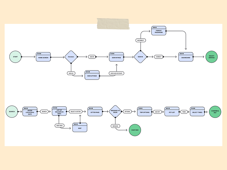
Step 3: User Flow
Based on the comparison of Rover and Wag, I created the onboarding flow for fetch! dog walking app. I kept the flow simple, and strived to meet both the business and user goals.
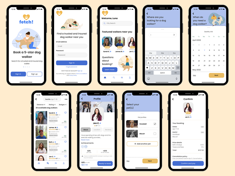
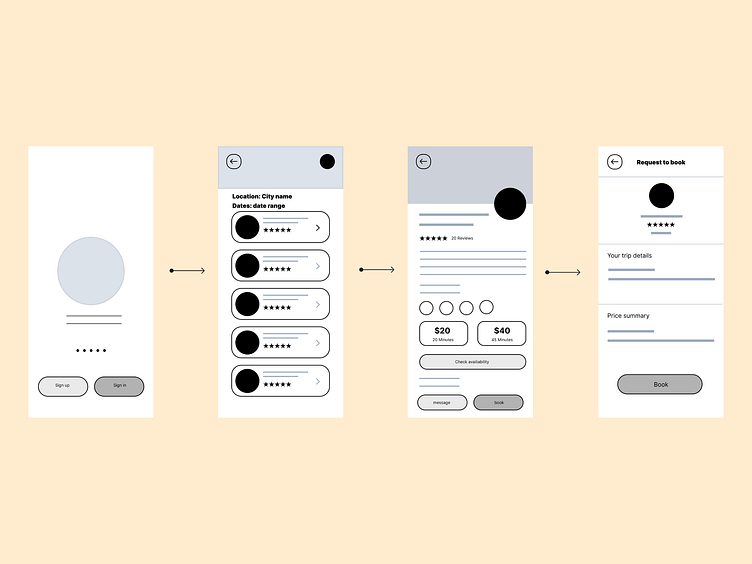
Step 4: Wireframes
I then put together a sign up flow and a search flow that could meet the needs of the user. I played around with different trust signals and focused on simplicity.
Step 5: Visual design
After critique reviews, I created high-fidelity designs and worked on branding elements based on the final version of the wireframe.
I began with a client mood board and then extended the visual branding to all the screens. I used consistent font, type size, and color. I also incorporated balance, proximity, alignment, hierarchy, repetition, and contrast.
I got feedback on my designs and ideated, then used Figma's auto layout and created a component library for all components.
Step 6: Prototype
I created a prototype to test with users and took notes. I noted the pain points at completing the task and made minor changes to buttons, font sizes, and hierarchy.
Feedback from testing provided valuable feedback for iterations.
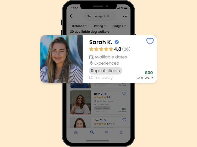
"On the screen with the list of dog walkers, I wasn't sure what was important. It seemed like there was a lot screaming for my attention. The 30 walkers available text is a little big and distracting. It would also be nice to see all the stars so they don't get lost amongst the badges."
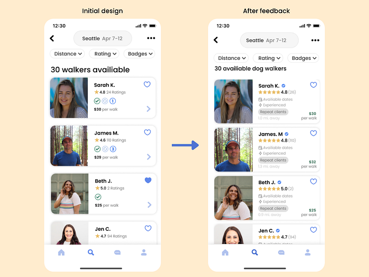
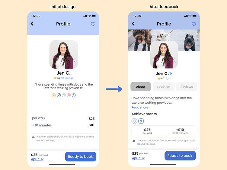
"I'd really love to see another image that a dog walker could post to share dogs they've walked or something that would let me get to see more into their dog walking experience."
"The badges don't tell me much."
"I think contrast could help certain elements stand out."
Step 7: Refine & Measure
In this step, I refined the designs, tested again, and measured success.
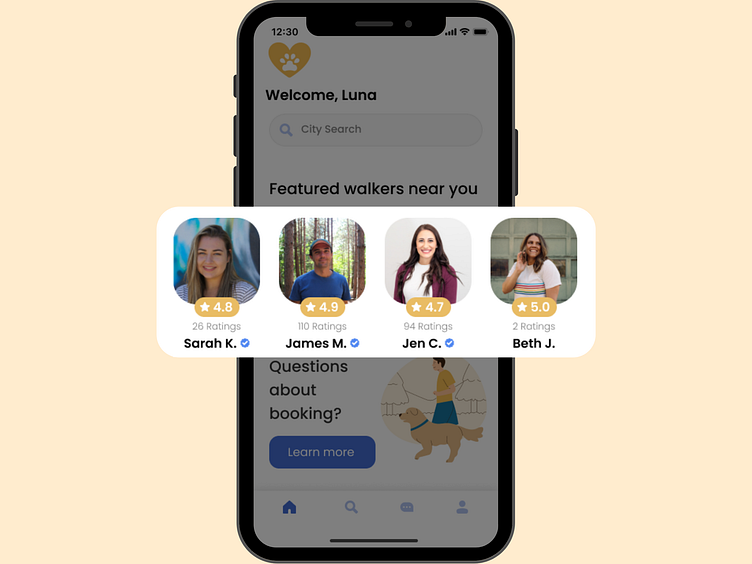
Users were more inclined to trust the walkers on this platform. From screen one, the landing page, the words "5-star" and "trusted and insured dog walker" were well liked.
Users felt the branding was professional and consistent. They liked the familiarity of the blue ticks from other social media platforms for trustworthiness and liked the ability to "skip" certain phases of the browsing process.