"UGLY": Behind the Scenes: Type Experiments


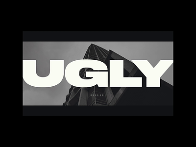
A few experimental typographical off-cuts from the production of “UGLY” — a (very) short film exploring the beauty in some of London’s most iconic Brutalist buildings.
Watch the short film on Vimeo
About these experiments
These are compositions for the trailer and promotional collateral. Near the point of release, I deliberated about whether to include quote marks around ‘UGLY’. The title of the film is (at least I hope) obviously tongue-in-cheek. I did have a few moments of mild panic when I started to wonder if people would get it. After sense-checking it with a couple of friends, I decided I was overthinking it and ran with the original super inflated type, bleeding off of the edge of the screen — retaining the speech marks in written comms and surrounding collateral.
The icing on the cake for these title and credit screens would have been some production logos. The downside of it being a totally independent project was there was no one to credit! So might have a play with a technical colophon logos just for fun.
Watch the short film and read more about it on Vimeo
Follow me
Twitter: @thehumanjpg
Website: humanjpg.com
Thank you for reading!
✌️