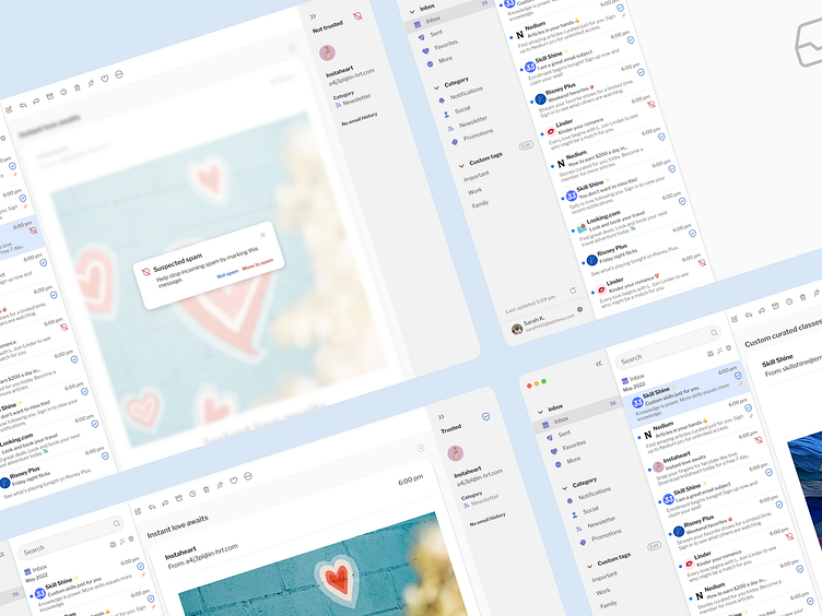
SecureMail Desktop Email Client App: Product Design Case Study
SecureMail is a desktop app that focuses on alleviating user pain points around spam emails.
Challenge
Emails often get a lot of spam, and it isn't always clear what users should and should not click on for their email security. I worked to create a desktop email client called SecureMail to identify possible spam emails as they come in.
Step 1: Market Research
The first step I took was to compile market research to find existing email services that offer a similar service. I then completed a competitive analysis for Gmail, Canary, Spark, Outlook, Aol, and Apple Mail.
Step 2: Interviews
I began my user interviews to narrow the focus and to take note of common user pain points who avidly used different mail apps. I wanted to find out what was important to the users when getting spam.
"It’s overwhelming when there are lots of messages. Spam is always a pain. I don’t like that if I click on a spam message, someone would see that I’ve opened the mail. It’s too easy that spam can get opened."
"I use different email addresses, one for personal and business and another for shopping because of spam."
"I heavily rely on my email client to do the work for me identifying what is and isn't spam."
Step 3: User flow
Based on the email comparison, I created the email flow for SecureMail. I kept the flow simple and strived to focus on the organization of spam messages and sending mail.
Step 4: Wireframes
I then started creating some low then high-fidelity wireframes that show where I would put the spam and security features before moving on to visual design.
Step 5: Visual Design
After peer critique reviews, I created higher-fidelity designs and visual design components. I got more feedback on my designs and continued to ideate.
I used consistent font, type size, and color. I also incorporated balance, proximity, alignment, hierarchy, repetition, and contrast.
Step 6: Prototype
I hooked up a prototype for opening trusted and not trusted mail and what those functionalities could look like.
Before finalizing my design, I got valuable feedback from testing the prototype.
"The trust icons seem a little small, I didn't really notice them until after a while."
"Maybe if you used more prominent icon colors or sizes."
"I like knowing what category the email is in the right sidebar, I'm familiar with email categories from my other email."
"Are all the emails unread or read? There isn't an indication of what's unread."
Step 7: Validate and Analyze
Users all liked the idea of trust badges to identify possible spam emails. After completing designs and testing, I believe that trust spam badges will improve user pain points around spam emails identified in earlier testing.
I've also identified common user patterns for improving design and organization for the next steps.


