KeyCare App - Case Study


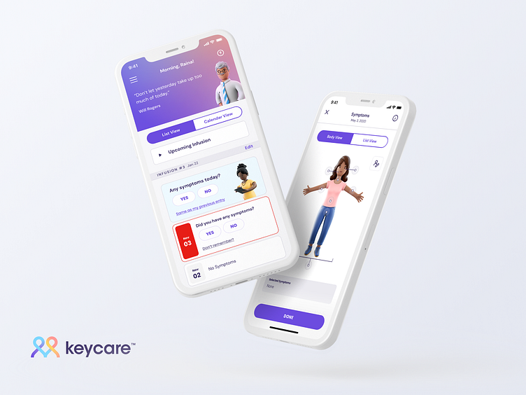
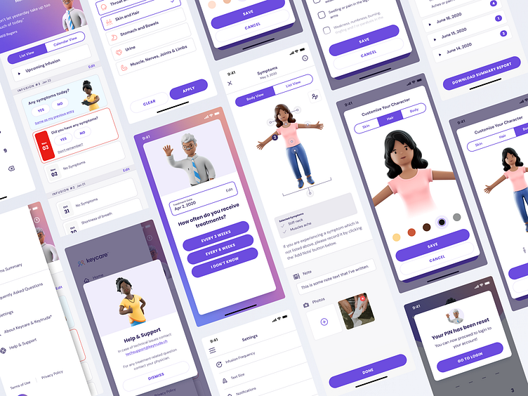
The KeyCare mobile application is a digital diary designed to help patients with their MSD treatment for lung cancer. It tracks symptoms, takes notes, accesses information about their specific treatment as well as offers additional resources and links for support. Patients can send reports to their medical team easily to regularly monitor how they are feeling.
The Challenge
Create an experience that makes a difficult cancer journey less stressful and confusing, while finding opportunities to speak hope and encouragement into the patients day-to-day journey.
Perhaps the biggest hurdle with this entire project was to be sensitive and empathetic to the people using the app. Cause lets be honest, in an ideal world, the need for this app doesn’t exist! So, if someone finds themselves in this situation, we want to walk alongside them in their journey and encourage hope whenever possible. We want to empower users and give them access to the tools and support they need, so they're reminded that they aren't in this fight alone.
Taking Stock
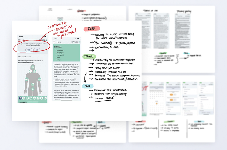
Our first step was to (with the client) take a look at where things were currently. We discussed problems, opportunities, and things that were already working well. We learned that a lot of the navigation felt a bit clunky and unintuitive. Additionally, many of the screens had an overwhelming amount of information presented, making it confusing and unintuitive to navigate, ultimately creating friction for new and existing users. Opportunity was ours for the taking!
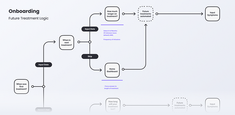
Establishing Flow
User flows are an invaluable part of our process. It creates an opportunity to streamline the experience as well as provide insight to the information architecture. We found multiple opportunities to improve the overall navigation and functionality of the app through this process.
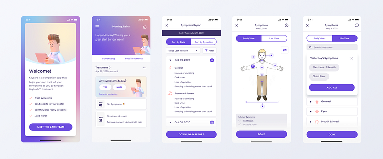
One example involved the core component of tracking symptoms. Making note of the bad feelings you’re having each day can feel overwhelming, discouraging, and monotonous. So rather than making the user re-enter the same symptoms each day, we created a “same as yesterday” one-tap button to quickly create a new entry if the symptoms were the same as the previous entry. We focused on making the user’s lift easier and keeping their focus on the completion of a task verses the mental weight of having to enter each symptom manually.
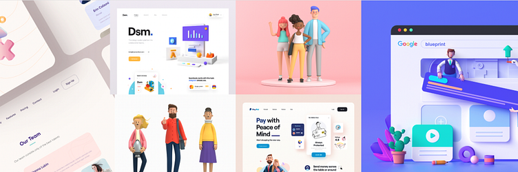
Get Style
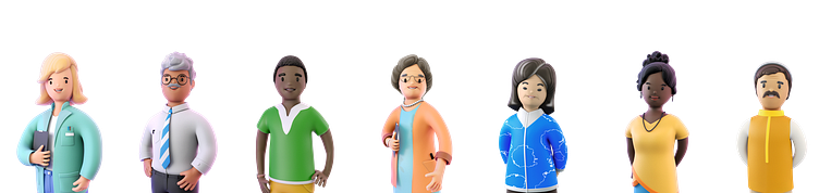
We started creating stylescapes taking into account demographics, markets, and general objectives. We created 3 different stylescapes each with a specific brand personality and feel in mind. A lot of this part of the process can feel like guess work, so to be a bit more objective and intentional - we used a characteristics chart as a guide. This allowed us to work together on building out the different potential visual directions.
Our goal was to reach a demographic typically 35+ and have been diagnosed with lung cancer. And as I said earlier - be sensitive to the fact that in an ideal world they never use this app.
After talking through the stylescapes with the client, we settled on one that had a warm, optimistic, and casual feel balanced with a level of tact and respectability creating an approachable and trustworthy visual direction. With that part of the puzzle filled in, we set sail and started exploring.
Ideate. Iterate. Repeat.
With the sails open and a course set before us, we began exploring a number of solutions. We played with various approaches to the onboarding screens to create a smooth onramp for users. We also found it to be incredibly important to encourage and delight the user where possible.
We recognized that existing as an app to track symptoms, the primary task for a user is to continue to log and make note of every time they aren’t doing well so they can share that with their doctor. However, that can quickly become a heavy and discouraging lift. So we found it to be incredibly important to introduce a number of ways to try to lighten that burden and speak hope and life into their journey where possible.
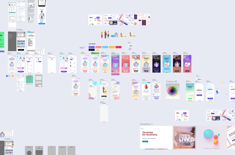
Through several rounds of iteration (both internally and with the client) we explored a number of experiences using color, UX, copywriting, and custom illustrations. Eventually we honed in on a visual style that we felt met the users where they were, and created an experience that felt encouraging and hopeful without ignoring the fact that the journey they are on, is a tough one.
The Result
We were able to create an app experience that Merck was thrilled with and one that we are incredibly proud of as well. Because not only does it solve real-life problems, but it does so in a way that comes along side the users who - by no fault of their own - have found themselves in an undesired and difficult situation. And thats when products are at their best - when they come along side unobtrusively and find ways to make life better.