#14 Marina Shever | UX/UI Designer | Interface for Day Zero


Test task completed — April 22, 2022
Contact — @sheverm (telegram)
Portfolio— https://www.behance.net/marinashever
Our comment:
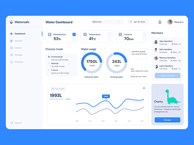
I liked how the screen looks, it's light, not overloaded with colors, and the accents are well placed. There is no consistency in the icons; it is evident in the menu navigation - some icons are filled with colors, and others are linear. And a user might think that the modules are unavailable because of the grey text. The functionality and composition of some blocks are not well elaborated. For example, empty spaces appear in a chart block (and it's not white space, either). Furthermore, the chart itself is not functional, it shows the stats over six months only, and the dropdown with the choice of the period, as planned, serves only for the statistics below.


